About:
Internal Reporting is Pluxee's reporting module that HR teams use to track how employees use their benefits. For years, every report was prepared manually by an internal team. We changed that.
Category:
UX/UI design
Client:
Pluxee
Year:
2025
Location:
Prague, Czech Republic
Design framework:
Lean UX
Tools:
Figma, Pluxee Design System, Dovetail, Teams
The problem:
HR specialists couldn't work with their own data because the tool didn't exist. Every report went through an internal team, creating delays and dependency on Pluxee's customer service.
Goal:
A self-service module that lets HR teams create, filter, export and manage their own benefit reports without contacting Pluxee support.
My role:
UX/UI designer leading the module end to end: stakeholder interviews, high-fidelity prototyping, moderated research and dev handoff.
Methods:
•
Stakeholder interviews
•
Process mapping
•
Tool benchmarking
•
High-fidelity prototyping
•
Moderated usability testing
•
Empathy mapping
•
Iteration workshop
•
Dev handoff
Think
Before designing anything, I needed to understand why reporting felt so slow and left HR teams dependent on internal support.
/01
Stakeholder interviews
I ran two stakeholder interviews to clarify goals and pain points, and we mapped the real reporting flow from the client's request to the final Excel export. The key insight: the data exists, but HR teams can't access it without asking someone inside Pluxee.
“Previously, we prepared the reports for the clients ourselves, but now we want to give them a tool that allows them to easily create reports themselves.” Jan Gillern, product manager.
“Exports and reports primarily serve HR specialists, so they need to be well-structured, easily filterable and quickly accessible.” Simona Kuldová, product manager.


/02
Current process mapping
From the stakeholder input I mapped the as-is reporting flow. Visualising it made the bottlenecks obvious: repeated manual database queries, custom formatting by internal teams and long waits between handoffs, ending in a static file nobody could reuse.

/03
Tool benchmarking
I analysed leading HR and analytics tools to see how they structure complex data, expose filters and handle exports, so we wouldn't reinvent basic patterns. The missing pieces: multi-team reporting, recurring automated exports and saved custom views.

Prototype
With the bottlenecks and requirements clear, I went straight to a realistic prototype built from the Pluxee UI library.
/01
High-fidelity from day one
I skipped low-fidelity wireframes entirely. Working from the business specification and the existing Pluxee design system, I built an interactive model of the reporting module right away, a tangible base to test and iterate on without wasting time.
Test
Task-based sessions with HR specialists showed where the interface held up and where it caused friction.
/01
Preparation
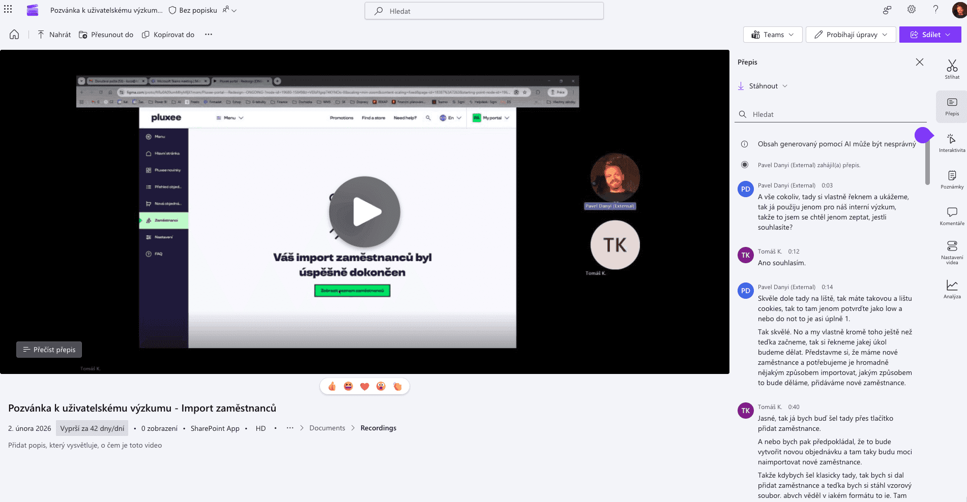
I wrote a structured testing script around the core reporting flows and ran moderated sessions with 10 HR specialists, our exact target users. Every session was recorded and transcribed in Dovetail to keep the analysis honest.
/02
Hypotheses
Before involving users, I reviewed the core flow with the product managers directly in Figma. The assumptions we left as comments became the hypotheses we tested.
/03
Usability testing
Scenarios built from those hypotheses went to specific personas from our database. Over 10 moderated sessions we watched where the prototype worked seamlessly and where people hesitated.
/04
Synthesis & prioritisation
I synthesised the sessions with empathy maps, then gathered every insight into one spreadsheet and prioritised the issues that recurred across sessions.

Iterate
An iteration workshop with stakeholders aligned user needs with technical feasibility. After the fixes, a final test confirmed a 100% task success rate.
/01
Reporting
I pulled the key filters out of secondary menus for instant access and replaced technical terminology with plain language. That removed the hesitation we saw in testing and made the prototype ready for development.

Outcome
HR specialists get a self-service way to create and export reports without waiting for Pluxee teams.
/01
Dev handoff
The project closed with a final stakeholder sign-off and a comprehensive Figma handoff mapping component behaviours and states for the developers.
/02
Impact
The new flow reduces ad-hoc report requests and turns standard reports into something HR teams run themselves. Product and development now have a tested pattern to reuse for future internal tools.
/03
What I learned
Designing internal tools is as much about changing habits as changing UI. Involving development early, and framing every decision in terms of implementation cost and support load, made the difference.
/04
Next steps
Roll the new flow out to a pilot group of HR clients and track how often they still ask for manual exports.
© More works
(WDX®)
digital design


© help centre
(WDX)
clarification









Let’s talk