About:
My Surf represents a ‘scan-and-go’ concept for surfboard rentals, eliminating the need for traditional shops. Operating through automated hubs at key beach locations, the app allows users to unlock equipment instantly via QR code.
Beyond convenience, My Surf prioritises safety by automatically notifying the local Coastal Guard upon rental activation, creating a safer environment for solo surfers.
Category:
Product concept
Year:
2025
Location:
Perth, Western Australia
Design framework:
Design Thinking, Human-Centered Security
Tools:
Miro, Notion, Figma, Google Suite, Typeform
Surf
Ocean
Freedom
Experience
The problem:
Rental shops operate on strict hours, limiting spontaneous sessions, and tourists often engage in risky solo surfing without local knowledge.
Goal:
Design an on-demand rental ecosystem where users can access equipment 24/7 via automated hubs using a simple QR scan, and integrate a safety protocol that syncs active sessions with the Coastal Guard for real-time monitoring.
My role:
Solo UX/Product Designer responsible for the end-to-end process, from service design concepts and user flows to the final UI and safety feature integration.
Methods:
•
User research
•
Service design mapping
•
User flows and wireframing
•
High-fidelity prototyping
•
Safety system logic
•
Usability testing
Discovery
Six semi-structured interviews with locals, tourists and backpackers at popular Perth beaches (Scarborough, Cottesloe), to identify barriers to spontaneous coastal surfing.
/01
Key research insights and user needs
Insights were synthesised into clusters informing the UI challenges. They validated the hypothesis: QR lockers address logistics and transport pains; real-time alerts tackle safety anxiety.

/02
User personas
Personas were developed by synthesising qualitative insights from in-depth interviews. By analysing recurring themes around spontaneity, logistics and safety, I identified distinct behavioural archetypes the product must serve.


/03
How might we
Based on the user insights, I reframed the core problems into opportunities using How Might We questions, bridging research and ideation.
Logistics and spontaneity (Lucas). How might we eliminate the burden of transporting equipment so Lucas can surf spontaneously between meetings?
Accessibility and time (Sarah). How might we decouple rental access from shop opening hours for early-morning surfers like Sarah?
Safety and confidence (Ben). How might we provide a digital safety connection that gives Ben the confidence to enter the water without an instructor present?
/04
Ideation and prioritisation
I facilitated a co-creation workshop with local surfers and backpackers to generate solutions directly with the target audience. Dot voting filtered the ideas and prioritised high-impact features for the MVP.

Define
Before detailed design, I needed to validate that smart lockers and the safety integration could form a sustainable business ecosystem.
/01
Business model canvas
Ideation confirmed desirability; the Business Model Canvas tested viability, mapping how the automated locker network, safety integrations and revenue models work together.
The canvas revealed a critical shift: from daily rentals to a pay-per-minute utility model, similar to e-scooters. This captures the spontaneous segment, while the Coastal Guard integration turns safety from a liability into a competitive advantage.

Concept development
From abstract requirements to visual concepts: first the whole service ecosystem, then rapid iterations on the interface.
/01
Visual thinking big picture
Before designing screens, I sketched the entire service ecosystem connecting Lucas on the beach, the app, the IoT locker mechanism and the Coastal Guard data integration, so the technology served the physical context of surfing, not just the screen.

/02
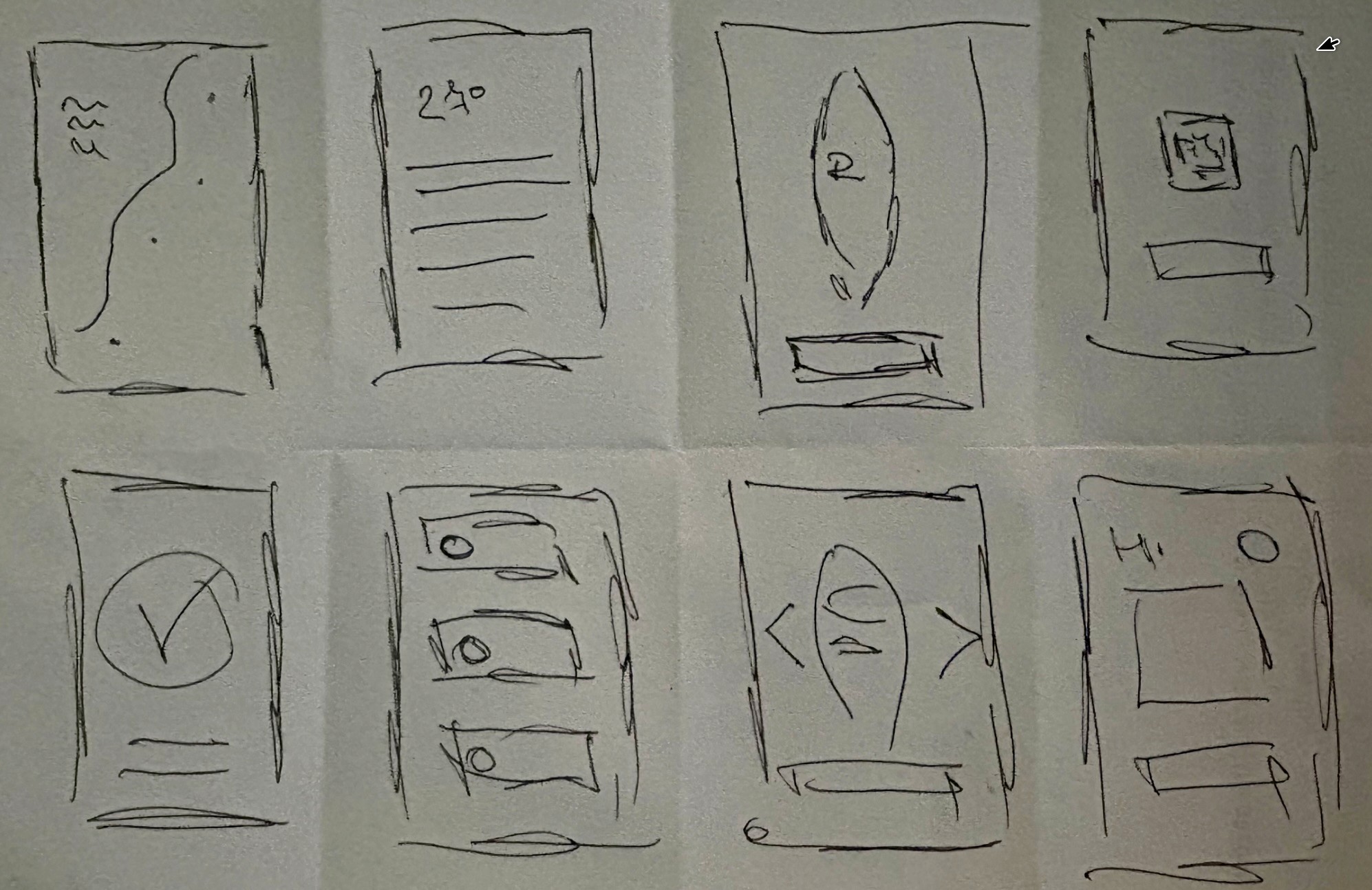
Crazy 8’s
Rapid sketching rounds to iterate on the specific user interface interactions of the rental flow.
Prototyping
In Figma I built a high-fidelity prototype of the happy path, from locating a hub to unlocking a board, with a visual language made for bright outdoor light and wet hands.
/01
Digital wireframes
Low-fidelity structure of the core flow before any visual design.

/02
High-fidelity UI
A palette of Deep Ocean Blue and Safety Orange reflects the coastal environment while keeping high contrast outdoors. The screens were connected into a clickable prototype to simulate the real-world experience.


Validation
Five potential users, a mix of backpackers and locals, tested the prototype using the Think Aloud protocol.
/01
Usability testing
Core scenario: locate a nearby hub, check board availability and unlock a beginner surfboard. The goal was to find friction points in the Scan to Rent flow.
/02
The friction
Price anxiety. Users hesitated at the unlock screen because they weren’t sure of the final cost. “What if I surf for 5 hours? Is it expensive?”
Safety fatigue. Users skipped the text-heavy safety warnings, missing crucial info about rip currents.
Lack of feedback. After tapping Unlock, users weren’t sure whether the physical locker opened.
/03
The fix
Price capping. A Max Daily Rate badge and a clear Estimated Total based on the selected duration.
Visual onboarding. Three swipeable cards (Weather, Rips, UV Index) that users must acknowledge, instead of a text block.
Sensory feedback. A prominent success animation and a vibration and sound indicator that mimic the physical click of the lock.
Outcome
/01
Impact
The solution turns a high-friction service into a seamless utility. It unlocks 24/7 revenue without staffing costs. For the user, it cuts time-to-surf from 45 minutes to 3, achieving a 4.8/5 satisfaction score.
/02
What I learned
Designing for IoT means thinking beyond the screen: physical delays, sunlight and wet hands. Trust is the currency of automation; without the visible safety alert, users hesitated to rely on a machine.
/03
Next steps
Validating the hardware ergonomics and securing regulatory approval.
© More works
(WDX®)
digital design


© help centre
(WDX)
clarification






Let’s talk