About:
Setting up new banking products used to be a fragmented, confusing process that forced bankers to rely on technical support. We redesigned the entire flow and introduced an intuitive stepper component.
Category:
UX/UI design
Client:
Leveris
Year:
2018
Location:
Prague, Czech Republic
Design framework:
Lean UX
Tools:
Figma, Leveris Design System, Zoom
The problem:
Bankers struggled to set up new products in a fragmented, overly complex interface and kept relying on technical support or senior colleagues to finish basic tasks.
Goal:
Restructure the setup flow around an intuitive stepper and clear terminology so administrators can complete it independently.
My role:
UX designer leading the redesign end to end: journey mapping, friction analysis, high-fidelity prototyping, guerrilla testing and dev handoff.
Methods:
•
Process mapping
•
How might we
•
User journey mapping
•
High-fidelity prototyping
•
Guerrilla usability testing
•
UX writing
•
Dev handoff
Think
Before designing anything, I needed to understand exactly why bankers struggled to set up new products.
/01
Identifying pain points
Analysis of failed sessions showed form sections that were fragmented and unnecessarily complex. Descriptions and mandatory fields were unclear, so users failed the setup outright and had to rely on technical support for basic tasks.
/02
Current process mapping
Mapping the as-is journey exposed the bottleneck: users pre-populated basic data fine, but got lost when extending parameters. Categorising the steps showed where the structural gaps were.

Create
A clean, self-serve flow that guides users naturally and lowers cognitive load.
/01
Restructuring the flow
I rebuilt the path for entering a new product definition. Grouping related settings logically removed two entire steps from the original flow without building any new components.

/02
Wireframing
Moving from UML flows to low-fidelity wireframes kept the focus on hierarchy and orientation. The result was a three-step sequence optimised for fast data entry.


/03
High-fidelity prototyping
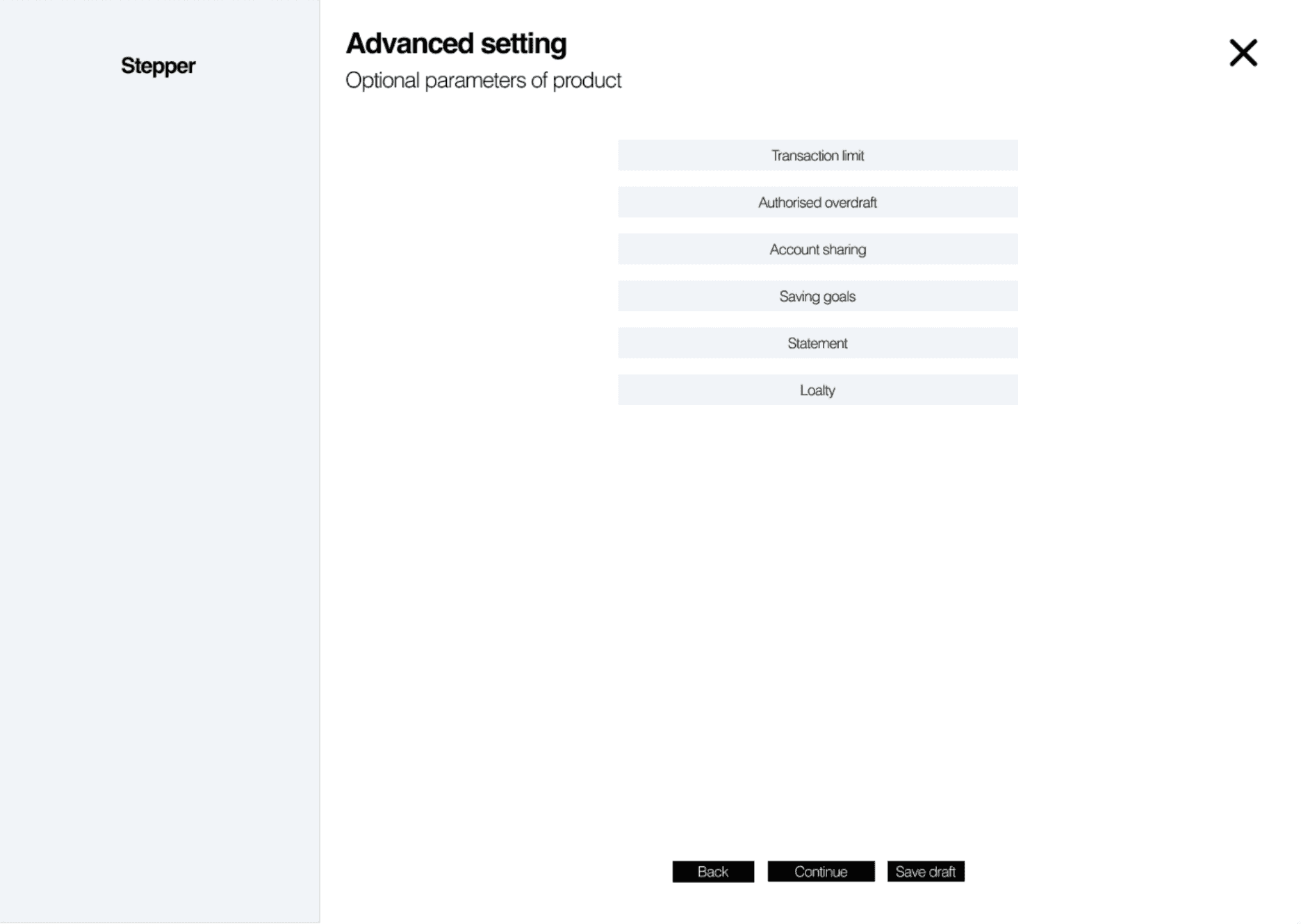
I designed a new stepper component with a structured menu and short, helpful descriptions, and rewrote item names so they were understood immediately, without technical jargon.
Validate
The prototype went in front of internal users to catch remaining friction before development.
/01
Guerrilla testing
Internal guerrilla sessions showed that users didn't need labels under every main category, and that the pricing scheme logic was over-grouped and had to be split into separate functional entities.

/02
Iteration with UX writers
With UX writers and the technical team we removed redundant labels, refined the copy and updated the final prototype.

Outcome
A frustrating, error-prone admin task became a self-service process bankers complete on their own.
/01
Dev handoff
After sign-off I presented the design in a grooming session with detailed behavioural specifications, so the new stepper was integrated into the wider design system.
/02
Impact
Tracking after launch showed a 90% increase in task success rate. Simplified copy and terminology alone raised early-funnel conversion by nearly 20%, and reliance on internal support dropped away.
/03
What I learned
Even complex banking systems don't need technical jargon. Simplifying architecture and copy reduces cognitive load for users and cuts internal support costs for the company.
/04
Next steps
Monitor adoption of the stepper across other banking modules and keep testing new design system components with a wider pool of administrators.
© More works
(WDX®)
digital design


© help centre
(WDX)
clarification









Let’s talk