About:
Svět příležitostí is the Pluxee career site: the culture, the open positions and the benefits on one page, designed for desktop and mobile.
Category:
Web design
Client:
Pluxee
Year:
2024
Location:
Prague, Czech Republic
Design framework:
User-centred design
Tools:
Figma, Pluxee Design System
The problem:
Candidates needed a quick way to see what working at Pluxee is like and which roles are open, in a site that matched the new brand.
Goal:
One page that tells the story, lists open positions and works just as well on a phone.
My role:
UX/UI designer: page structure, content hierarchy, desktop and mobile design.
Methods:
•
Content hierarchy
•
Wireframing
•
Responsive design
•
Design system
Brief
Pluxee needed a career site that sounds like the brand and gets candidates to an open role fast.
/01
Who it is for
Candidates who arrive from a job board or a referral and want to know two things quickly: what it is like to work here, and which roles are open right now. Everything else on the page supports one of those two questions.
/02
First version
The first layout put the story and the open positions on one short page: a hero with a clear call to see open roles, four tiles about working at Pluxee (#bethechange, Transformuj, Rosteme společně), the list of open positions and the Pluxee products underneath.

Design
The final page grew into a full story, without losing the shortcut to open roles.
/01
Hero and opportunities
“Svět příležitostí” opens with a single message and one action, Volné pozice. Below it, the brand's X shape frames real people in the four culture tiles, so the page feels like Pluxee rather than a generic job board.

/02
Open positions
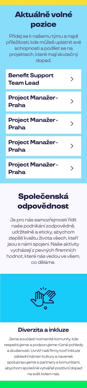
Open roles sit in a simple, scannable list with one row per position. Candidates who already know what they want never need to scroll past the story.

/03
Responsibility and benefits
Social responsibility (diversity and inclusion, team spirit, innovation, experience) and concrete benefits (holiday, meal vouchers, Cafeteria contributions, flexible work, pension contributions) answer the questions candidates usually ask in the first interview.

/04
Contact and footer
The page closes with a direct invitation to write to the HR team and the shared Pluxee footer, so the career site stays part of the wider brand.

Mobile
Most candidates browse on their phone, so every section was designed for a 360 px screen too.
/01
Mobile version
The tiles stack into a single column, the open positions become full-width rows with large tap targets, and the benefits keep their icons so they stay scannable on a small screen.

/02
Built from the design system
Layouts, type and components come from the Pluxee design system, which kept the site consistent with the rest of the ecosystem and easy to hand over.

© More works
(WDX®)
digital design


© help centre
(WDX)
clarification







Let’s talk