Self checking kiosk for coworking centre
This project focuses on the design and implementation of a system for automated nighttime access and onboarding of new users at a coworking center.
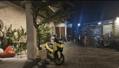
The inspiration comes from the issue that people without membership are unable to use the coworking center during night hours, randomly when needed outside of opening hours, or for other urgent work requirements.
Year:
10/2024 - 01/2025
Category:
UX/UI Designer
Client:
B Work / Masaryk University
Duration:
3 weeks
Location:
Perth, Western Australia
Tools:
Teams, Figma, Google Sheets
Design process:
Design Thinking
Surf
Ocean
Freedom
Experience
The project itself :
Project Brief & Strategy
As an employee of a European company, I work online and need to be available during European business hours. One day, I was flying back from Australia to Bali, where I had planned to use a coworking center and had scheduled user research late in the evening.
To my surprise, all the coworking centers I found did not offer immediate onboarding or after-hours access. It made me wonder, was this just my case? Or was it something standard? So, I started to investigate and I focused on one of the most famous coworking centers in Bali – B Work.
Hypothesis:
Coworking centers (specifically B Work) are losing potential leads and revenue because they do not allow ad hoc access for new users outside of standard business hours. Professionals with urgent needs or travelers arriving late are unable to use the facilities due to the lack of an automated onboarding system.
Goal:
To create a solution (automated self-check-in kiosk/system) that allows easy registration, payment, and immediate access to the coworking center 24/7 without the need for staff presence, thereby increasing the center's usability and revenue.
My role:
Interaction Designer responsible for the entire design process, from initial research and problem definition to prototyping and validation.
Responsibilities:
conducting user research & surveys
competitor analysis & benchmarking
stakeholder interviews
defining personas & empathy maps
user flow mapping & storyboarding
high fidelity prototyping in Figma
usability testing & iteration
All about the user :
Research Phase
For inspiration and a better understanding of how other coworking centers operate and whether they have their own check-in system, I found that none of the large coworking centers use such a system. I focused mainly on coworking centers in Bali, Australia, and the Czech Republic.
Safari service
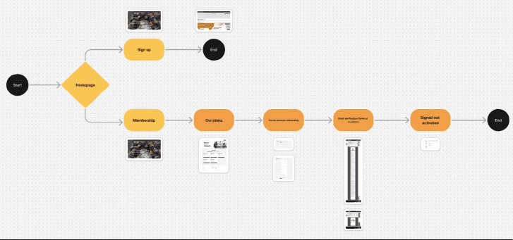
For some reason, the website offers two registration options. The first is a sign-up section that leads to a broken page with small print indicating that there is a waiting list for membership.
The second path is through membership, where a potential member can even register, and after selecting a membership, they will receive an email with the terms of service. Both paths are peculiar and inadequately address the situation. I mapped these paths by taking screenshots of each page and creating a specific flow to have a clear overview of how it works in reality.
To avoid biases, however, I wanted to understand why this was happening. So, I went to the B Work in the later hours and looked for someone who could explain what was behind this.


Stakeholder interview
Through communication with the staff on WhatsApp, I obtained the contact of the coworking center's general manager, who, unfortunately, was not present during my research. I decided to send him a questionnaire that included about ten open-ended questions. My main goal, however, was to answer two key questions:
Why do the websites support registration but not payment, while physical registration still works?
Why is it not possible to obtain membership and to confirm not only hypotheses but also the reasons why the website does not function as an onboarding tool, and whether there is any interest from the coworking center in having the option for automatic nighttime registration.
"The current website doesn't work so that you can register and pay and use the membership straight away. This is now because our coworking center is overcrowded and we are trying to filter out other members, however we still allow people to register physically."
B Work Management
The main insights is:
Registrations operate physically during working hours due to a reduction in applicants and capacity reasons.
They would appreciate any system or suggestion that would help us to register people outside of business hours.
User surveys & interviews
Now it was necessary to obtain information and confirm or refute the hypotheses from the users of the coworking centre themselves, but also from potential interested parties. First, I created a questionnaire that contained open and closed questions about whether there is really an interest in night registration or if they have experience with self checking registration or how would like to see this registration.
A total of 12 responses were collected and analysed to identify recurring patterns and themes.
However, I was interested to see how respondents would react if I asked them in person. So I took the questionnaire and asked random users in the coworking center. In the end, I got 6 more respondents. In the end, the answers did not differ and my hypotheses were confirmed.

Empathy map
An empathy map helped me organize the insights from surveys and interviews to better understand the needs, concerns, and motivations of users when registering and accessing coworking spaces outside regular opening hours.

Qualitative persona
An empathy map helped me organize the insights from surveys and interviews to better understand the needs, concerns, and motivations of users when registering and accessing coworking spaces outside regular opening hours.


Back to the brief
Following the recommendation of my interaction design teacher, Matěj Kaninský, from Masaryk University in Brno, I applied a so-called UX Project Brief for this project.
Having gathered sufficient data and confirmed my hypotheses about the existing problem, I compiled this brief in accordance with his advice.

Competitors analysis
Following the recommendation of my interaction design teacher, Matěj Kaninský, from Masaryk University in Brno, I applied a so-called UX Project Brief for this project.
Having gathered sufficient data and confirmed my hypotheses about the existing problem, I compiled this brief in accordance with his advice.
From Concept to Viable Business:
Define & strategy
Transitioning from ideation to strategy, I needed to validate that the proposed features specifically the smart lockers and safety integration could form a sustainable business ecosystem. The goal was to map the strategic fit between user needs and business viability before commencing detailed design work.
Business model canvas
While the ideation phase confirmed user desirability (what surfers want), I needed to validate the product's viability (how it functions as a business). I utilised the Business Model Canvas to map the entire ecosystem defining how the automated locker network, safety integrations, and revenue models work together to create a sustainable service.
The canvas revealed a critical shift in the business model: moving from traditional daily rentals to a pay per minute utility model (similar to e scooters). This captures the 'spontaneous' market segment while the Coastal guard integration transforms safety from a liability risk into a unique competitive advantage

from strategy to sketch
Concept development
Translating strategic definitions into tangible solutions. In this phase, I moved from abstract requirements to visual concepts. I started by mapping the holistic service ecosystem using Visual Thinking to ensure the physical and digital touchpoints worked in harmony, before using Crazy 8’s to rapidly iterate on the specific user interface interactions
Visual thinking big picture
Before designing screens, I needed to visualise the 'big picture'. I sketched the entire service ecosystem connecting Lucas (the user) on the beach, the App interface, the IoT locker mechanism, and the coastal guard data integration. This free form mapping ensured that the technology served the physical context of surfing, not just the screen.

Crazy 8's
Once the system flow was defined, I zoomed in on the critical 'Scan to Rent' moment. Using the Crazy 8’s technique (8 sketches in 8 minutes), I forced myself to move beyond the first obvious solution. I explored various layouts for the unlocking interaction testing thumb zones, camera placement, and feedback messages to find the most intuitive path

From lo-fi to hi-fi
Prototyping & interaction
Based on the sketches, I moved into Figma to build a functional High Fidelity Prototype. My focus was on the 'Happy Path' the ideal user journey from locating a hub to unlocking a board. I established a clean visual language (UI Kit) that prioritised readability in bright outdoor conditions, using high-contrast elements and large touch targets for wet hands
Digital wireframes
Before applying visual design, I moved into Figma to create Low-Fidelity Wireframes (Grayscale). This allowed me to focus purely on information architecture, spacing, and user flow without the distraction of colours or imagery. I validated that the 'Scan' button was accessible within the thumb zone and that the map interface remained legible.

High-Fidelity UI
Once the structure was solid, I applied the visual identity to create High-Fidelity Screens. I chose a colour palette (Deep Ocean Blue & Safety Orange) that reflects the coastal environment while ensuring high contrast for outdoor visibility. I then connected these screens into an interactive Clickable Prototype to simulate the real-world experience.

Testing hypotheses
Validation & iteration
Based on the sketches, I moved into Figma to build a functional High Fidelity Prototype. My focus was on the 'Happy Path' the ideal user journey from locating a hub to unlocking a board. I established a clean visual language (UI Kit) that prioritised readability in bright outdoor conditions, using high-contrast elements and large touch targets for wet hands
Usability Testing
I validated the high fidelity prototype with 5 potential users (mix of backpackers and locals) using the 'Think Aloud' protocol. Participants were asked to complete a core scenario: 'Locate a nearby hub, check board availability, and unlock a beginner surfboard.' The goal was to identify friction points in the 'Scan to Rent' flow.
🔴 The Friction (Issue)
Price Anxiety: Users hesitated at the unlock screen because they weren't sure of the final cost. "What if I surf for 5 hours? Is it expensive?"
Safety Fatigue: Users skipped the text-heavy safety warnings, missing crucial info about rip currents.
Lack of Feedback: After tapping "Unlock", users looked confused about whether the physical locker opened.
🟢 The Fix (Design Iteration)
Added Price Capping: I introduced a "Max Daily Rate" badge and a clear "Estimated Total" based on selected duration to build trust.
Visual Onboarding: I replaced the text block with 3 swipeable graphical cards (Weather, Rips, UV Index) that users must acknowledge.
Sensory Feedback: I added a prominent success animation and a "Vibration/Sound" indicator to mimic the physical "click" of the lock.
The project conclusion
Outcome
The final 'My Surf' concept successfully bridges the gap between digital convenience and physical recreation. By automating the rental process, we removed the logistical barriers that prevented spontaneous surfing, creating a scalable solution for both locals and tourists
Takeways
The MVP proved that separating possession (owning a board) from access (renting on-site) is the key to unlocking the 'spontaneous' market. Users valued the Zero Carry Time proposition over the variety of equipment
Impact:
The solution transforms a high-friction service into a seamless utility. It unlocks 24/7 revenue without staffing costs. For the user, it cuts 'Time-to-Surf' from 45 mins to 3 mins, achieving a 4.8/5 satisfaction score.
What I learned:
I learned that designing for IoT requires thinking beyond the screen considering physical delays, sunlight, and wet hands. Crucially, I discovered that trust is the currency of automation; without the visible Safety Alert, users were hesitant to rely on a machine
Next Steps
Moving forward, the focus shifts to validating the hardware ergonomics and securing regulatory approval
Physical Prototyping: 3D print a scale model of the smart locker interface to test the ergonomic placement of the QR code and lock mechanism in real-world conditions.
Pilot Pitch: Present the usability data and Coastal Guard safety integration plan to the City of Stirling council to secure permits for a live trial at Scarborough Beach.


