About:
A team experiment investigating how dark patterns shape user behaviour during one of the most friction-loaded moments in any subscription service: cancellation.
Category:
Behavioural design
Client:
Masaryk University, behavioural design course
Year:
2025
Location:
Brno, Czech Republic
Design framework:
Design Thinking
Tools:
Figma, Maze, Dovetail, Microsoft Teams, Google Sheets
The problem:
Cancelling Disney+ takes several screens of offers, pauses and repeated confirmations. We wanted to know whether people notice the manipulation, how it makes them feel, and what it costs in success and time.
Goal:
Compare the real flow with dark patterns against an honest alternative, with both qualitative and quantitative evidence.
My role:
I led the quantitative research stream and the synthesis of all data: moderated qualitative findings, unmoderated Maze results and empathy maps into one coherent story.
Methods:
Think
We started by agreeing on what we actually wanted to learn and what we did not. The framing phase determined every decision downstream, from prototype scope to recruitment criteria.
/01
Topic selection
The topic emerged from a shared frustration. Linh had cancelled her own Disney+ subscription the day before our first team meeting and had been forced through three separate confirmation screens. Kateryna proposed dark patterns as the broader research area, and we agreed within one conversation that Disney+ cancellation was the right concrete case common enough to recruit for, painful enough to generate strong reactions, and representative of an industry-wide pattern rather than a one-off bad design.
/02
Research plan & validation
We drafted a Discovery → Define → Prototype → Test → Synthesise plan and sent it to our supervisor, Laďka Zbiejczuk Suchá, for validation. Her feedback shaped two important decisions: that qualitative testing alone would not produce hard enough data, and that we should add an unmoderated A/B test in Maze to triangulate the moderated sessions. She also confirmed that unmoderated testing would let us reach a larger sample without overloading the team.
/03
Hypotheses
We set three hypotheses before designing anything, so that the prototypes could be built to test them rather than to confirm them.
/04
Team roles
We split the work according to existing strengths. Kateryna took dark-pattern identification and prototyping in Figma. Linh took prototyping support and the full qualitative research stream recruitment, moderation and Dovetail synthesis. I took the quantitative stream in Maze and the final synthesis across both data sources.
Prototype
The prototype phase had two parallel goals: faithfully reproduce the live Disney+ cancellation flow (Prototype A), and design an ethical alternative that removed the dark patterns without losing any functionality (Prototype B).
/01
Identifying the dark patterns
Working through the live Disney+ flow screen by screen, we identified a textbook Roach Motel pattern reinforced by three reinforcing techniques: intentional invisibility of the cancellation option, pressure elements (repeated upsells and "keep" CTAs), and emotional manipulation through framing copy ("Need a break?", "Get even more"). Mapping these explicitly gave us the negative brief for Prototype B.
/02
Prototype A Dark patterns
A high-fidelity reproduction of the live Disney+ cancellation flow built in Figma. Visually weighted "Pause subscription" button, multi-step confirmation, upsell screen offering Disney+ Premium, and reverse-prominent "Cancel" CTA. The dark-pattern signals were preserved exactly as they appear in production.

/03
Prototype B Classic patterns
A three-step alternative built on the same Disney+ design language but stripped of manipulative elements. Equal visual weight for "Cancel" and "Pause", no upsell interstitial, no FOMO framing in the confirmation copy, and a single optional feedback question on exit instead of mandatory survey steps. The goal was simple, ethical, transparent not minimalist for its own sake.

Test
Testing ran in two streams that fed each other: moderated qualitative sessions to understand the why, and unmoderated A/B testing to measure the how much.
/01
Recruitment
Linh started recruitment during the prototyping phase rather than after a deliberate lesson applied from previous projects. The call went out across multiple channels in parallel, targeted explicitly at people with prior Disney+ experience. The early start meant testing slots were filled before the prototypes were even ready.

/02
Moderated testing qualitative
Ten respondents went through both prototypes in moderated Microsoft Teams sessions. We used a think-aloud protocol, screen and audio recording, and a prepared script with a recording-consent step. Sessions averaged 30–40 minutes. The data went into Dovetail for tagging.


/03
Unmoderated testing quantitative
Thirty respondents ran the same task in Maze across three days. We tracked completion rate, drop-off rate, misclick rate and time-on-task per prototype. The unmoderated format let us reach a sample size that moderated sessions alone could not have supported in the available time.


Iterate
The midpoint of the research surfaced two findings that changed how we interpreted everything that followed.
/01
Habituation: the quiet finding
One respondent said, during the dark-pattern flow: "I actually don't mind that it's four steps it's like this everywhere on these platforms, so I'm used to it." The quote stopped the session. It pointed directly at the Habituation Theory: repeated exposure dampens the emotional response to friction until the user reads it as normal. The dark pattern was working not because users could not see it, but because they had stopped reacting to seeing it.
/02
A possible bias in the qualitative protocol
Showing both prototypes back-to-back in the same session likely amplified the preference for Prototype B. The contrast made the dark-pattern version look worse than it would have in isolation. We flagged this as a methodological limitation and used the unmoderated quantitative data to check whether the preference held independently. It did but the size of the gap should be read with the comparison effect in mind.

Delivery
I synthesised both streams into one picture: what people felt, and what it cost them in success and time.
/01
Qualitative synthesis
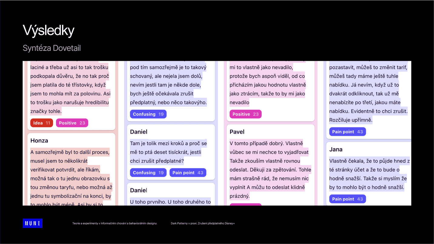
Across ten respondents we tagged 43 pain points, 23 positive moments, 19 instances of confusion and 11 user-generated ideas. The pain points clustered on three points in the dark-pattern flow: the hidden cancellation entry point, the unexplained warning icon, and the upsell screen that interrupts the cancellation intent.
/02
Empathy maps
We built two empathy maps — one per prototype — directly from the tagged Dovetail quotes. Prototype A surfaced phrases like "This just makes me angry", "3 times is too much" and "Oh my god, they're idiots". Prototype B surfaced "This version is much clearer", "I like that I don't have to fill in a reason" and "I feel good about this one".


/03
Quantitative results — Prototype A
Task completion: 80%. Drop-off rate: 20% hree respondents left the test before finishing. Misclick rate: 41.2%, indicating sustained confusion and orientation loss across the flow.

/04
Quantitative results — Prototype B
Task completion: 100%. Drop-off rate: 0%. Misclick rate: 31.8%, materially lower than the dark-pattern variant. Average time-on-task dropped from 2 min 26 s to 50 s in the unmoderated test, and from 3 min 53 s to 1 min 12 s in the moderated sessions.
Outcome
All three hypotheses confirmed, with numbers behind them.
/01
Hypotheses confirmed
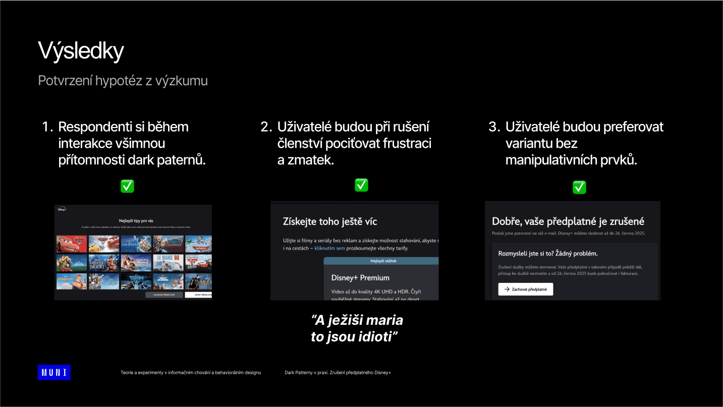
All three hypotheses were confirmed. Respondents did notice the dark patterns once attention was drawn to them. They did experience frustration and confusion — verbally, repeatedly, and at predictable points in the flow. And 100% of qualitative respondents preferred the version without manipulative elements, supported by sharper quantitative metrics across the board.
/02
Impact
The experiment produced a documented comparison that quantifies the cost of dark patterns in one specific flow: 20 percentage points of completion, full elimination of drop-off, and roughly two-thirds reduction in time-on-task. The data is small but directionally unambiguous, and reproducible by anyone willing to build the two prototypes.

/03
What I learned
Habituation is the part of the dark-pattern story that gets undersold. Users do not need to be tricked they need to be exhausted, and then the trick becomes invisible. That insight reframes the design ethics question: the harm is not in the moment of manipulation but in the long tail of normalisation.
Two methodological lessons followed. First, showing both variants in the same moderated session inflates preference for the better one, so the moderated and unmoderated streams need to be read together rather than separately. Second, qualitative testing benefits from a single moderator per session splitting the role across the team during this project occasionally pulled the script in different directions
© More works
(WDX®)
digital design


© help centre
(WDX)
clarification

Let’s talk