About:
Můjpass.cz is a nationwide venue database where Sodexo clients find places to spend their employee benefits. Nobody had touched the UX in years. We fixed that, and rebranded it to Pluxee while we were at it.
Category:
UX/UI design
Client:
Pluxee (Sodexo)
Year:
2022 – 2023
Location:
Prague, Czech Republic
Design framework:
Design Thinking
Tools:
Figma, Pluxee Design System, Teams, Dovetail
The problem:
Users weren't failing to find benefit venues because they weren't there, but because the interface buried them: broken filters, outdated content, no mobile logic. Engagement and revenue were dropping.
Goal:
Design an intuitive, mobile-first search aligned with the new Pluxee identity, improve orientation and increase revenue through better merchant visibility.
My role:
Lead UX/UI designer, end to end: stakeholder interviews and research, wireframing, testing and final UI.
Methods:
•
Stakeholder interviews
•
Service Safari
•
Internal interviews
•
Analytics review
•
Moderated qualitative research
•
Empathy mapping and personas
•
Competitive analysis
•
HMW workshop and dot voting
•
Crazy 8's design studio
•
Wireframing and prototyping
•
Guerrilla and moderated usability testing
Empathize
I needed to understand why users were leaving, what the organisation thought the problem was, and where those two stories didn't line up.
/01
Stakeholder interview
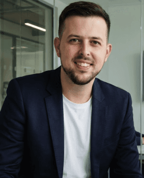
The project started with a single quote from Jakub Mačát, Head of Product Communication. Using the 5 Whys, that one quote unravelled into something more uncomfortable: a product nobody had touched in years, built on a system everyone was afraid to change.
/02
Service Safari
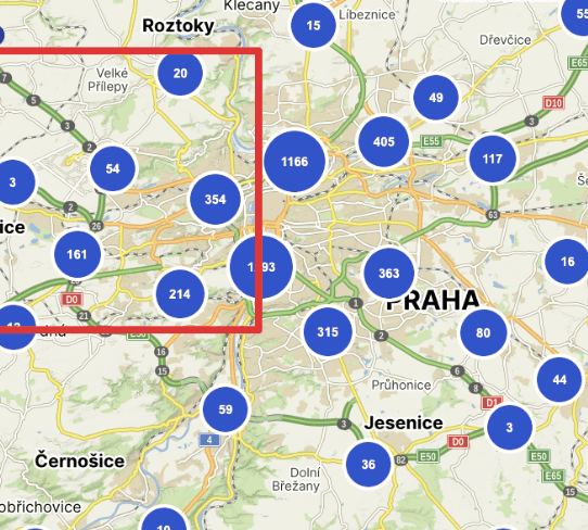
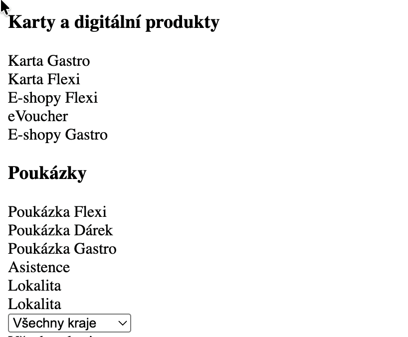
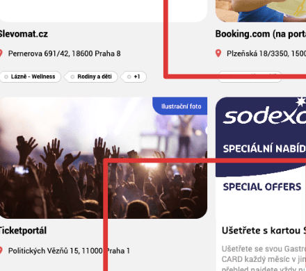
I stepped into the shoes of an HR manager trying to find a nearby lunch spot using paper vouchers. The experience was a disaster: a sluggish map, cluttered filters, and venue photos that had nothing to do with the actual location. The platform wasn't just unhelpful. It was actively pushing users towards Google Maps.
Three friction categories came out of it. Visual and UI friction: the map overloaded, filters overcomplicated. Performance: slow load times, users bounced before results appeared. Content reliability: outdated info and misleading photos broke trust.
/03
Internal interviews
Three departments, three completely different definitions of the problem. Sales feared any data changes: the venue database, however broken, was their core sales argument. Development confirmed years of technical debt and failed fixes. Customer Support simply validated everything the Service Safari had already shown.
The friction between departments turned out to be as informative as the user friction itself. If internal stakeholders can't agree on the problem, no redesign will survive the handoff.

/04
Analytics review
Google Analytics and Hotjar don't have opinions. They just count, and the numbers were uncomfortable. Half the users never touched the core features built to help them most. Nearly half were on mobile, a platform the design barely acknowledged. The product wasn't failing because users didn't care. It was failing because the interface gave up on them first.

/05
Moderated research
Real users, real sessions, semi-structured and online, with people who already knew the platform. The goal wasn't to fish for new problems but to confirm the ones already found. The hypothesis built from the Service Safari and internal interviews needed either validation or a funeral. It got validated.

/06
Empathy mapping
What users say and what they actually do are two very different things. Each moderated session was paired with an empathy map of what users said, thought, felt and did. The pattern was consistent across every participant: they felt confused, said nothing out loud, and quietly switched to a competitor.

/07
Competitive analysis
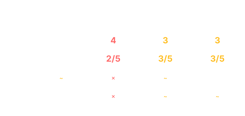
Direct competitors on the Czech market had already solved what Můjpass.cz hadn't: mobile-first layouts, clear venue descriptions, reliable content. The comparison wasn't flattering, but it was exactly the argument needed to move stakeholders from “it's fine” to “we have a real problem”.
Define
Research told me what was broken. Synthesis told me what to focus on.
/01
Personas
Three users, three completely different relationships with the same broken product, built from moderated research, customer support logs and field observations. Not archetypes, but real behavioural patterns.
The HR manager navigates the map on a lunch break, short on time and with low tolerance for friction. The end user opens the app once a month and gives up. The power user has learned every workaround because the system forced them to.
/02
User journey
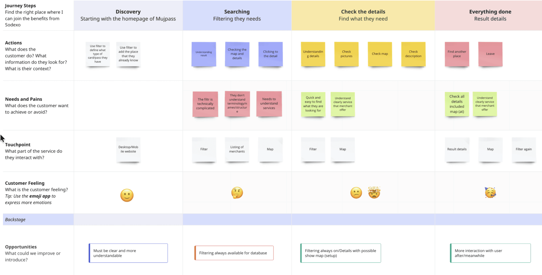
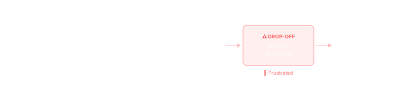
Mapping the full journey from “I want to find a lunch spot” to “I give up” revealed one critical insight: users didn't abandon the platform because they couldn't find venues. They abandoned it because two venues looked identical. No descriptions, no photos, nothing to choose between. That single friction point became the north star for everything that followed.
Ideate
Not in a meeting, not in a slide deck. In a room with markers, paper and people who had never run a design workshop before.
/01
HMW workshop
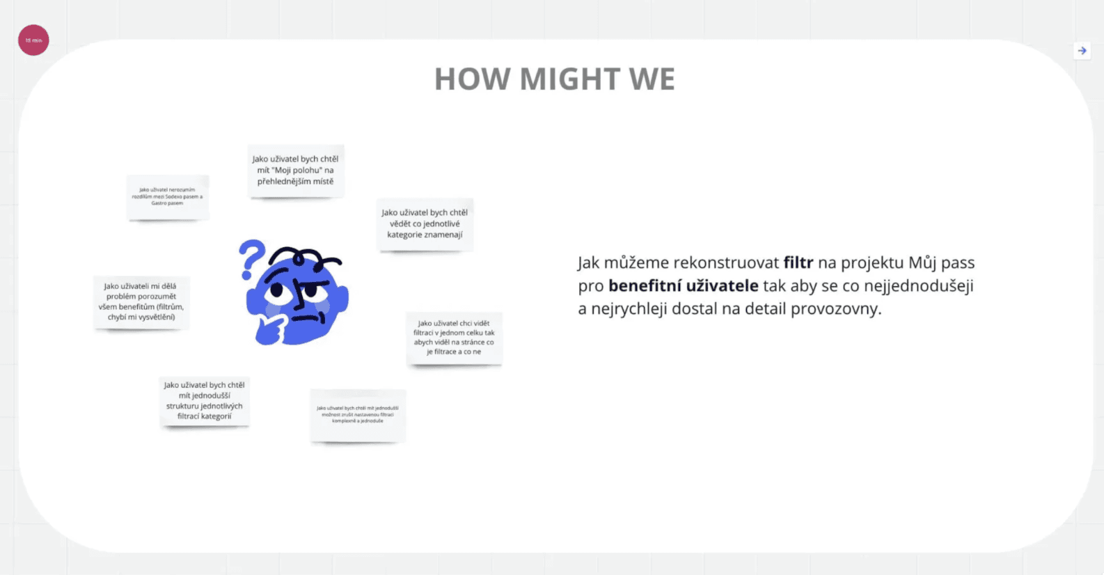
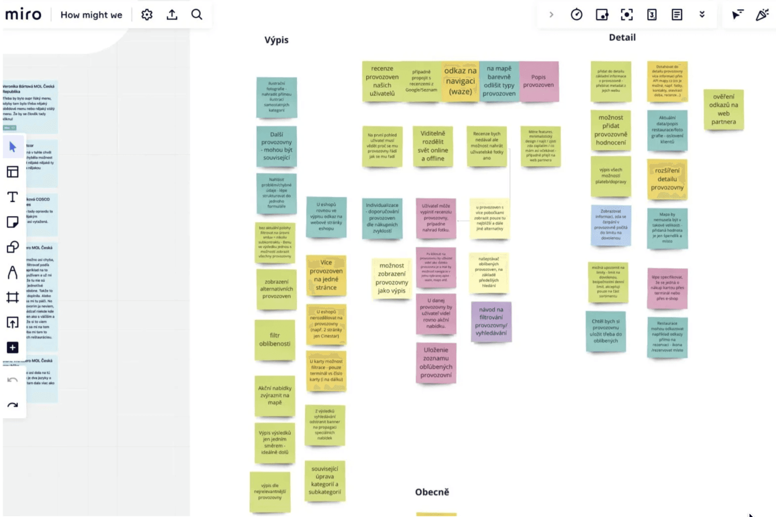
The first UX workshop in the company's history. It opened with an icebreaker where participants designed their own avatars, to loosen up a room full of people who hadn't agreed on anything in years. How Might We surfaced old unresolved tensions fast: Sales, Development and Management each had a different definition of the problem. That friction turned out to be the most valuable output of the day.
/02
Crazy 8's
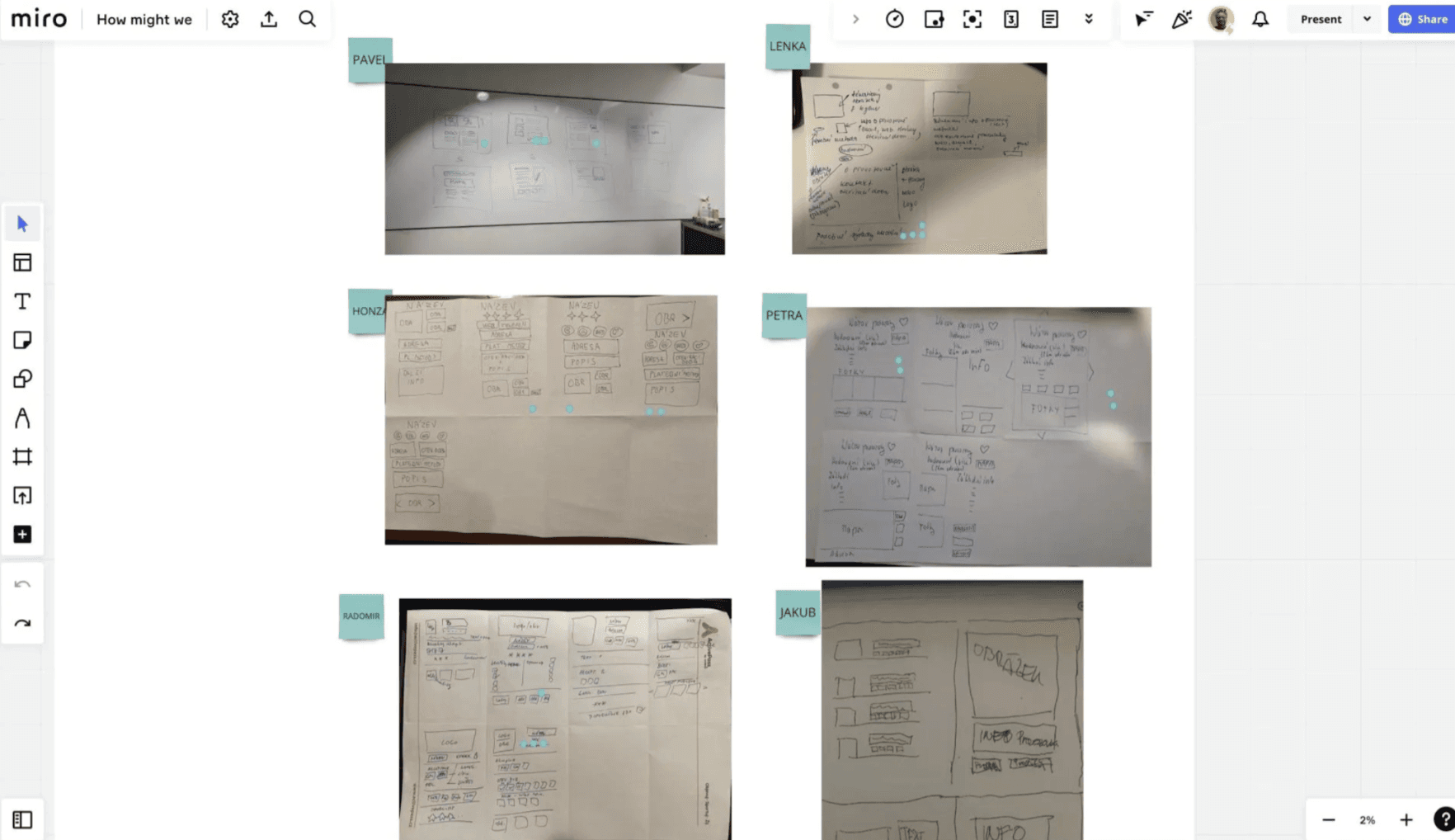
Eight minutes, eight sketches, zero excuses. Every participant, including stakeholders who hadn't held a pen at work in years, sketched eight UI concepts. The result was 24 raw concepts for the homepage and venue detail, three different mental models of what benefit search should be, and one sketch that accidentally nailed the final onboarding flow.
/03
Dot voting
Not by seniority, not by the loudest voice. By dots. The vote cut through the noise and surfaced two clear wireframe directions worth developing. Concept F won by a landslide: action-first layout, minimal filters, venue content front and centre.
Prototype & test
Dot voting gave a direction. Figma gave it structure, and real users picked the winner.
/01
Two wireframe models
Two lo-fi models addressed the same problems with different information hierarchies. Model A kept the map as the primary interface: familiar, but friction-heavy. Model B flipped the logic: list-first, content-forward, progressive filters. Both went into testing without visual polish, to test structure rather than aesthetics.
/02
Guerrilla, then moderated
The first pass was internal and fast, enough to catch the obvious breakages. The second used the same moderated format as the earlier research, with the same users who had tested the original product months before. That continuity mattered: they compared the broken version with the new one with their own hands, not from memory.
/03
The friction, the fix
Model B won unanimously. Less information fighting for attention, more of the right information at the right time.
Too many options at once became progressive disclosure: the top three filters visible, advanced options behind one tap. Empty venue cards with only a name and address became content-first cards with a photo, category tag and one-line description. The slow map with overlapping pins moved to a secondary tab, with a fast list as the default and the benefit type shown as a tag.
Deliver
A shipped rebrand, a new component library, and a UX process the company now uses by default.
/01
Pluxee rebrand and UI
Model B became the foundation for the final Pluxee visual implementation. The hard part wasn't applying the new identity. It was building components that didn't exist yet, such as venue cards, filter chips and benefit type tags, from scratch within strict brand constraints.
/02
Component library
The new components shipped into Pluxee's global design system. Future projects across the Pluxee ecosystem now inherit venue cards, filter chips, benefit tags and empty states instead of rebuilding them.
/03
A new UX process, company-wide
This was the first structured UX process the company had run end to end. Moderated testing, HMW workshops, Crazy 8's and A/B prototyping went from “never done before” to standard practice. The process outlasted the project.
Outcome
What shipped, what I learned and what is still open.
/01
Impact
The rebrand shipped to production and the component library landed in Pluxee's global design system. For the first time, Sales, Development and Management aligned on a shared problem, and that alignment outlasted the project.
/02
What I learned
Designing within organisational constraints is itself a design problem. The gap between “validated” and “shipped” is where most UX work quietly disappears. Involving development earlier, and framing every design decision in terms of implementation cost, isn't optional. It is the work.
/03
Next steps
The functional redesign remains open until the underlying system is rebuilt; then Model B goes live. Next: re-run moderated testing against the shipped Pluxee UI to see whether the rebrand alone moved task completion, time on search and drop-off at venue detail, and take the findings to the new product team with a phased rollout plan.
© More works
(WDX®)
digital design


© help centre
(WDX)
clarification

Let’s talk